

Kara
Montreal, Canada - 2025
Logo Design
Brand Design
Visual Identity Design
Typography & Color Systems
Packaging Design
Iconography & Illustration
OVERVIEW
Kara is a Montreal-based cosmetic brand offering a line of shea butter products crafted with care and intention. Rooted in nature and simplicity, the brand embraces a serene, youthful energy expressed through gentle scents and a refined, sensory experience.
CHALLENGE
The goal was to develop a visual identity that balanced youthful charm with a sense of calm sophistication. Kara needed to stand out in the beauty space while remaining true to its natural, artisanal roots inviting trust and connection through softness rather than noise.
APPROACH
Created a branding system built on elegant, muted color palettes and organic forms that evoke nature in a modern, minimal way. The typography is soft yet confident, and the packaging design emphasizes clarity and warmth. This subtle visual language reflects Kara’s identity: nurturing, approachable, and quietly distinctive.


Crafting Kara’s Visual Signature
The Idea Behind the Logo Design
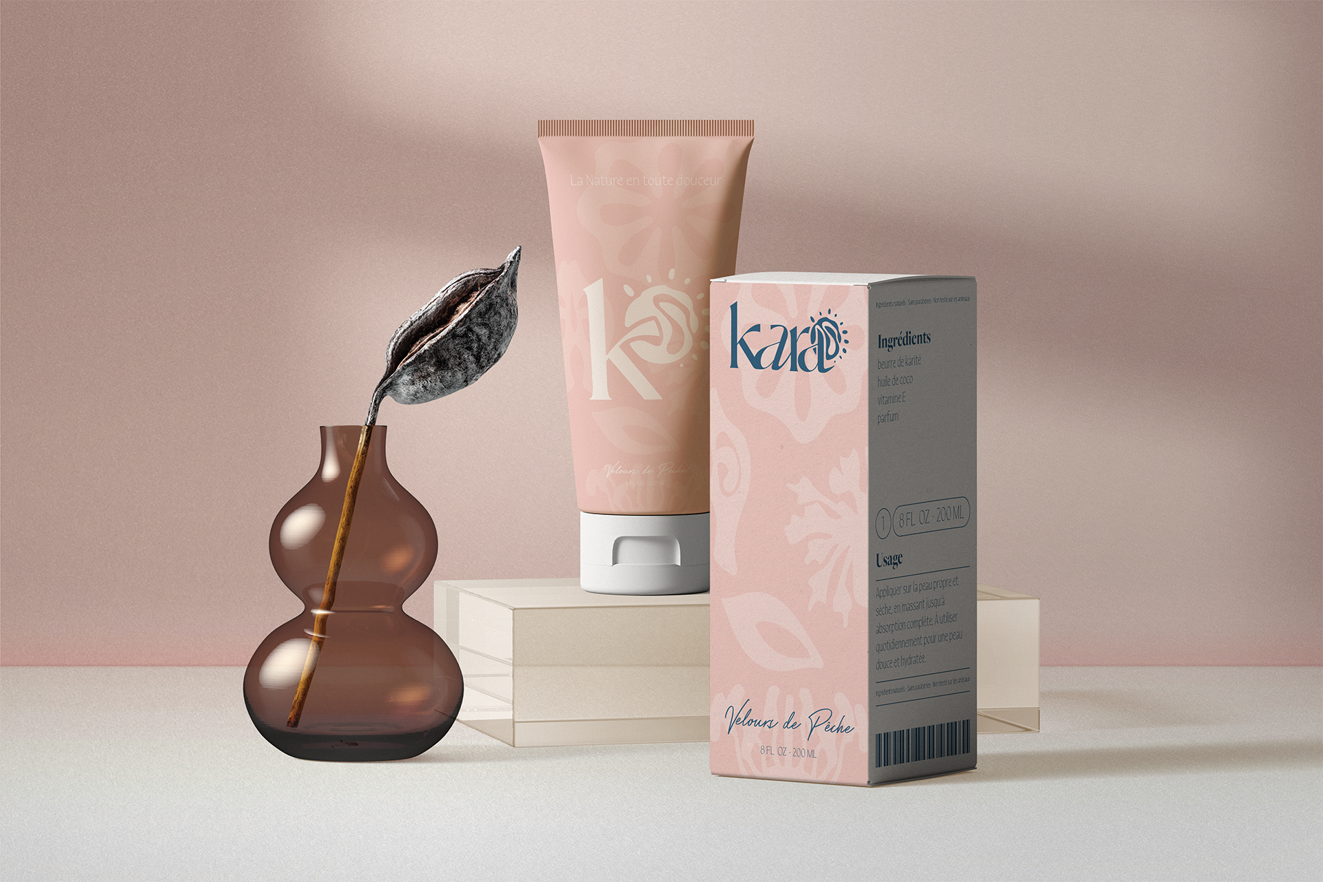
The Kara logo was designed to visually express the brand’s core values: softness, nature, and self-care. The primary wordmark combines elegant, fluid letterforms with a creamy, sun-inspired emblem—symbolizing nourishment, warmth, and the natural richness of shea butter. The sun shape mimics the gentle swirl and movement of cream, giving the identity a sensory, tactile dimension.
The secondary mark isolates the letter "K" alongside the sun element, offering a flexible and instantly recognizable shorthand. This alternate logo retains the brand’s softness while offering versatility across small formats and packaging applications.
Together, the primary and secondary marks form a cohesive visual language—refined, organic, and serene—perfectly aligned with Kara’s muted, elegant brand palette and its mission of effortless, joyful care.


Formed by Nature, refined by Design
Kara’s Brand systems and graphic elements
Inspired by the natural structure of the shea plant, Kara’s visual language is built on soft, organic forms that feel both intentional and intuitive. The graphic elements, abstracted from stems, seeds, and petals, flow gently across the brand world, echoing the creamy textures and botanical roots of the product itself. These shapes don’t just decorate; they guide, support, and soften, creating a sense of movement and calm throughout the packaging and communication. This is further enriched by a muted, serene color palette, powdery blues, soft rose, and blush tones, that evoke a quiet confidence and sense of care. Paired with elegant, flowing typography, the visual system becomes a gentle narrative, one that speaks to nourishment, nature, and the subtle beauty of calm.


