

RYMCO
Abidjan, Côte d'Ivoire - 2025
Logo Design
Brand Design
Visual Identity Design
Typography & Color Systems
Iconography & Illustration
Overview
Rymco stands as a beacon of power, performance, and reliability for riders across Ivory Coast and Morocco. With over 20 years of legacy, Rymco delivers high-quality motorcycles designed to meet the unique demands of African streets and highways. This project focused on revitalizing Rymco’s brand identity to reflect its strong, innovative spirit and commitment to dependable mobility.
Challenge
The main challenge was to create a cohesive and modern visual identity that communicates Rymco’s core values, strength, reliability, and innovation, while appealing to a diverse audience ranging from daily commuters to adventure seekers. The brand needed a system that could unify digital and physical touchpoints while standing out in a competitive market.
Approach
Our approach centered on crafting a streamlined yet expressive brand language that balances minimalism with bold, energetic elements. We developed a flexible design system with a carefully curated color palette and typography that convey power and precision. The brand’s iconography and illustrations were designed to be clear, mechanical, and scalable, ensuring consistency across all applications.


Where Power Meets Precision
The Idea Behind the Logo Design
The Rymco logo system is built around three core elements: the icon, the wordmark, and the combination mark.
Icon: A minimalist, geometric symbol designed to evoke mechanical strength and precision. It functions as a powerful standalone mark that can be scaled across various digital and print platforms without losing clarity.
Wordmark: A sleek, custom typographic treatment of the name “RYMCO,” crafted with clean lines and balanced letterforms that embody the brand’s modern and reliable identity.
Combination Mark: A harmonious pairing of the icon and wordmark, offering flexibility and reinforcing brand recognition in diverse contexts.


Building a Unified Story
The Brand Systems
The brand system revolves around a versatile and dynamic color palette, including primary shades of deep black (#0A0B0B), vibrant red (#D12335), and soft off-white (#F4F4F2), complemented by secondary tones to support diverse design needs.
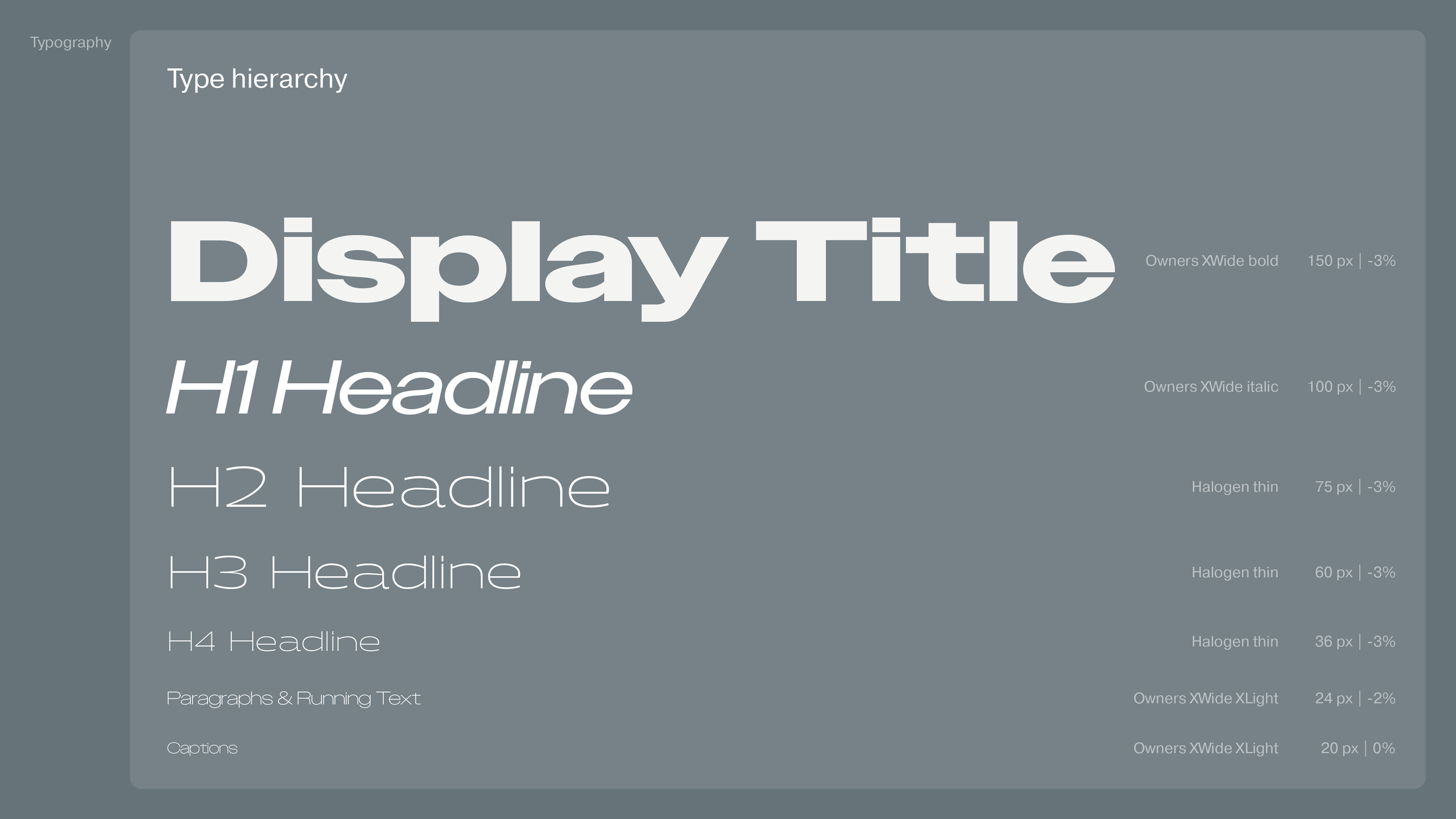
Typography plays a critical role, ranging from sleek minimalism to expressive, bold weights, allowing the brand to adapt its tone depending on the context, whether communicating energy or restraint.
The iconography and illustrations follow a vector based, geometric style designed for clarity and legibility. These elements provide visual cues across interfaces and marketing materials, reinforcing a consistent and functional brand language with no unnecessary details, just clear, purposeful design.


