TOPIA
Canada - 2025
Logo Design
Brand Design
Visual Identity Design
Social Media & Digital Marketing Design
Packaging & Product Design
3D mockup, Visualization and Animation
Website Design - UX/UI Design
Banner & Print Media Design
Presentation Design
Overview
TOPIA is a bold Canadian rolling paper brand inspired by the concept of utopia, a celebration of imagination, individuality, and elevated experiences. More than a smoking accessories label, TOPIA is a lifestyle space that fosters community through curated design and premium-quality products. Every element of the brand, from product packaging to digital presence, is infused with vibrant energy and creative freedom, inviting users to shape their own ideal world.
Challenge
The challenge was to craft a unified brand experience that resonated with free-spirited, design-conscious consumers in a highly competitive market. TOPIA needed to stand out visually and conceptually, while maintaining clarity across packaging, digital platforms, and content strategy. The identity had to speak to both individuality and community, striking a balance between expressive aesthetics and cohesive storytelling.
Approach
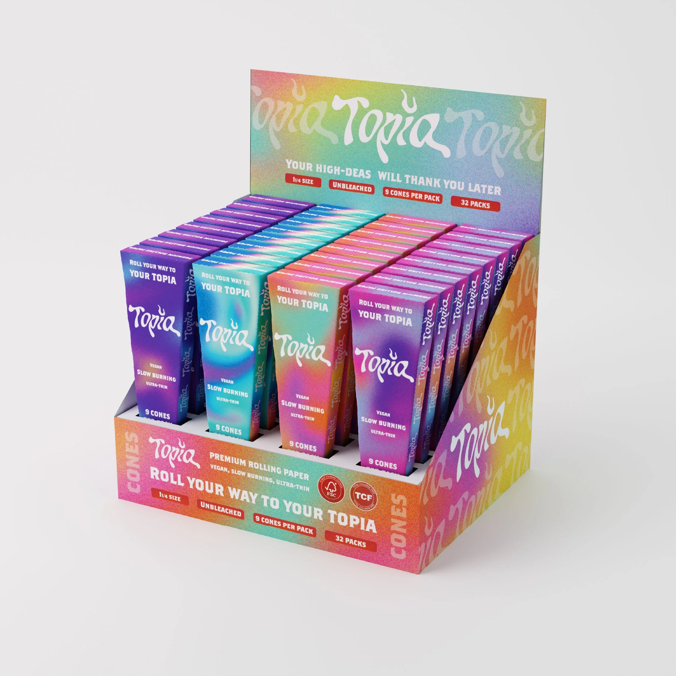
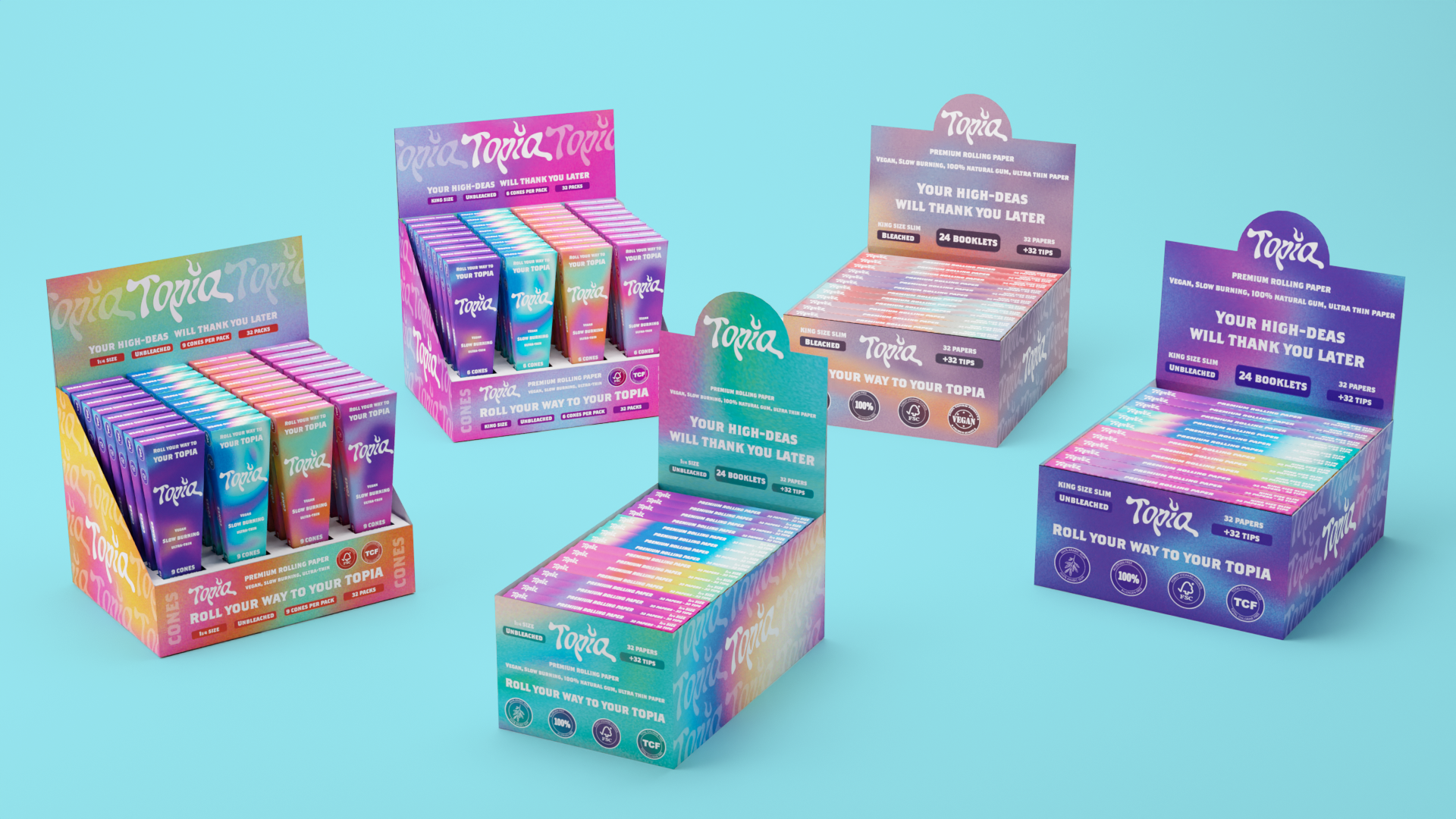
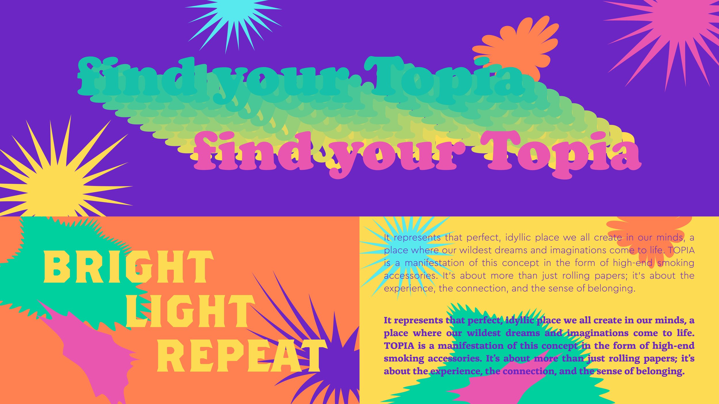
We approached the brand by leaning into the expressive, fluid qualities of the smoking experience itself. The visual identity is anchored in a custom logotype that mimics smoke, organic, flowing, and subtly surreal, with the dot on the "i" reimagined as a tiny flickering flame. This sets the tone for a brand language that is both playful and sophisticated. The color palette is bold and kaleidoscopic, ranging from electric purple to sunlit yellow, reflecting diversity, creativity, and joy. From packaging to 3D product mockups and social media assets, every touchpoint was designed to evoke a vibrant, immersive experience rooted in individuality and connection.


Smoke, Shape, and Story
The Logo Design & Brand Systems
TOPIA’s visual identity is rooted in fluidity, imagination, and self-expression. The custom logotype flows like smoke, organic, wavy, and dreamlike, while the dot on the “i” flickers like a tiny flame, nodding to ritual and ignition. Surrounding the logo is a dynamic system of graphic elements: deformed, distorted geometric shapes that feel playful, surreal, and alive, echoing the spontaneity of the experience.
The visual language is further enriched by vibrant, oil-spill-inspired gradients and grainy textures, created using the brand’s electric color palette. These layered compositions add movement and mood to the packaging, making each product feel tactile and expressive. The result is a visual identity that blurs the line between fantasy and function, modern, psychedelic, and unmistakably TOPIA.


Solidifying TOPIA’s Brand
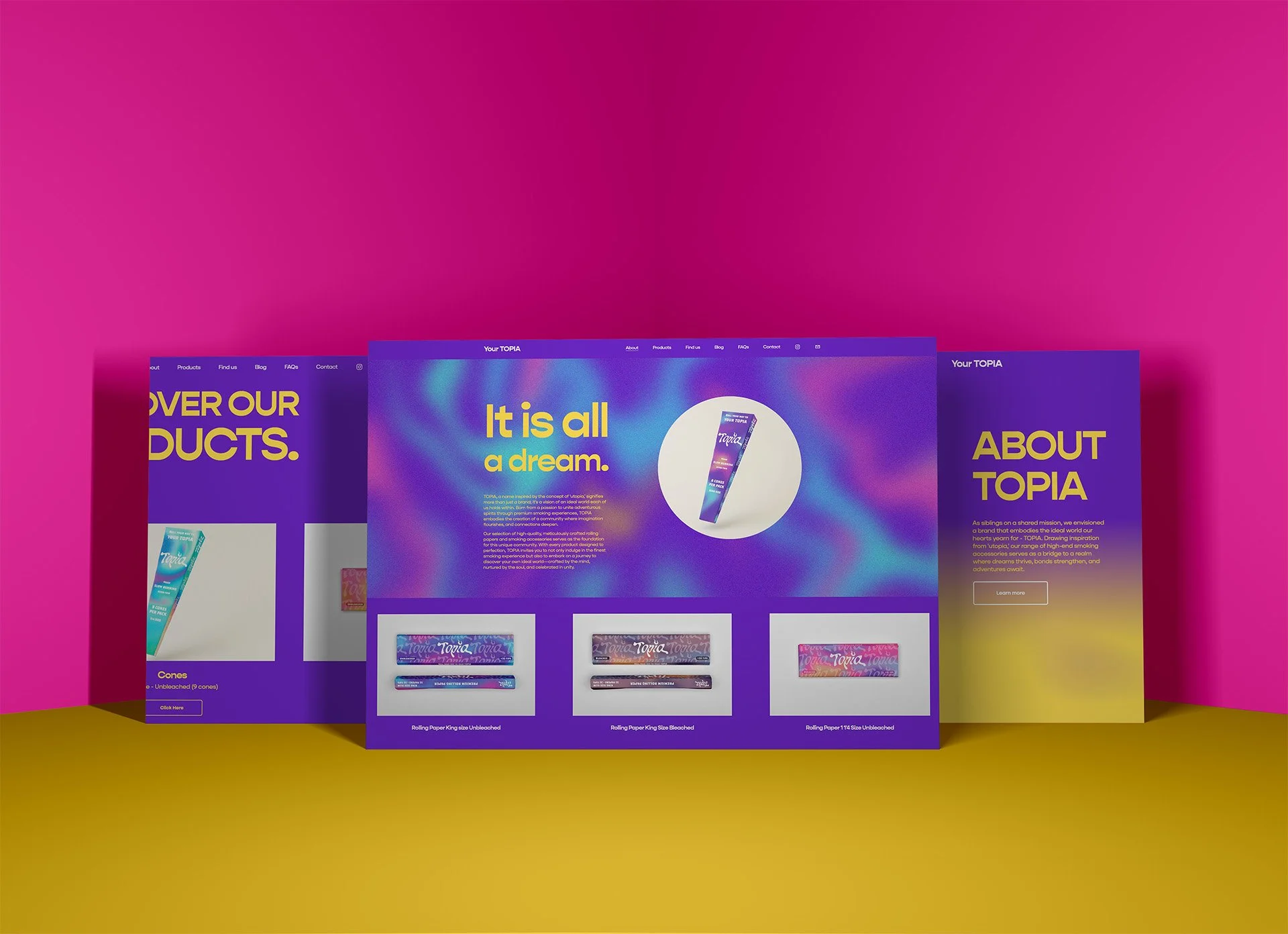
Designing the Website & Brand Presentation
TOPIA’s digital presence was designed to immerse users in the brand’s vibrant world while maintaining intuitive functionality. The website combines sleek UX/UI with colorful, energetic visuals to highlight the full product range, while also offering space for storytelling through a dedicated blog. Smooth navigation and bold layouts reflect the brand’s confident voice and creative spirit, helping turn casual visits into deeper engagement.
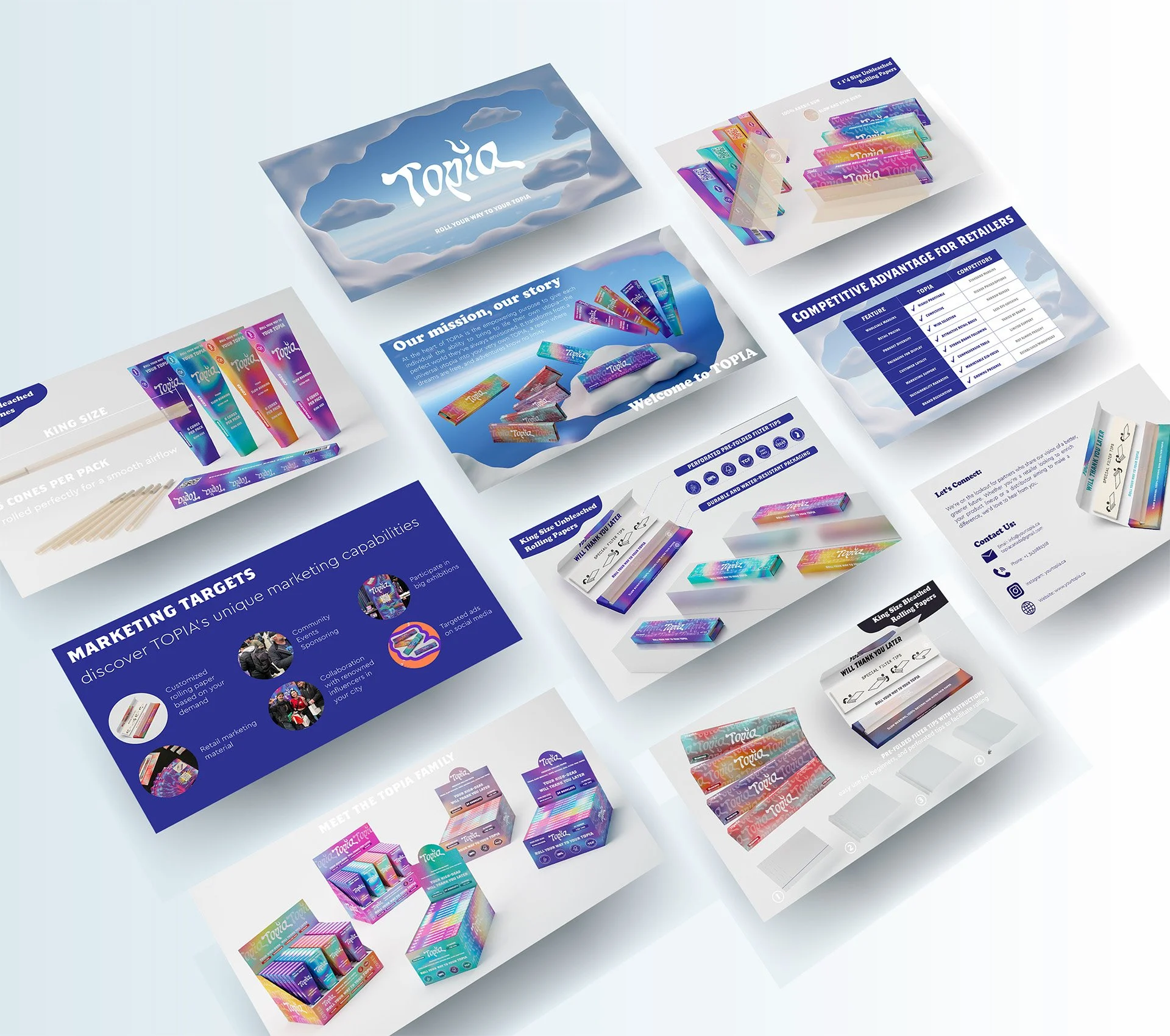
In parallel, we crafted an investor presentation that visually echoes the same ethos, playful yet precise. The deck serves as a strategic tool to communicate the brand’s mission, product positioning, and market potential with clarity and style. Together, the site and the deck offer a cohesive digital experience: equal parts commercial, cultural, and emotional, amplifying TOPIA’s vision across audiences and platforms.


Packaging Design
-
![]()
Real Teal
-
![]()
Purple Fever
-
![]()
Coral Blossom
-
![]()
Pink Rush


DISPLAY BOXES DESIGNS