

UBERHAUS
Various Places - 2019/2022
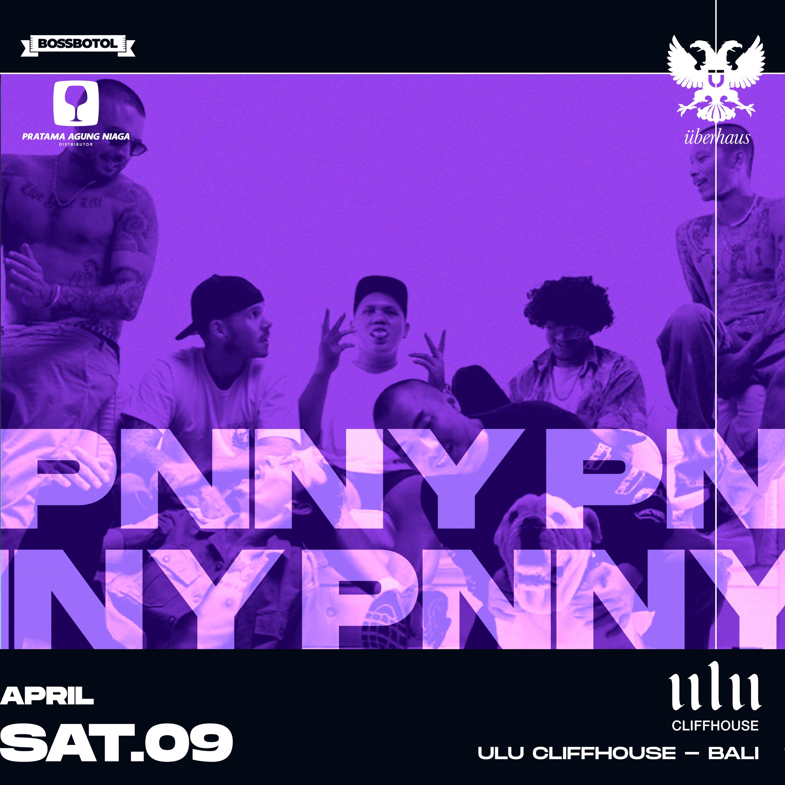
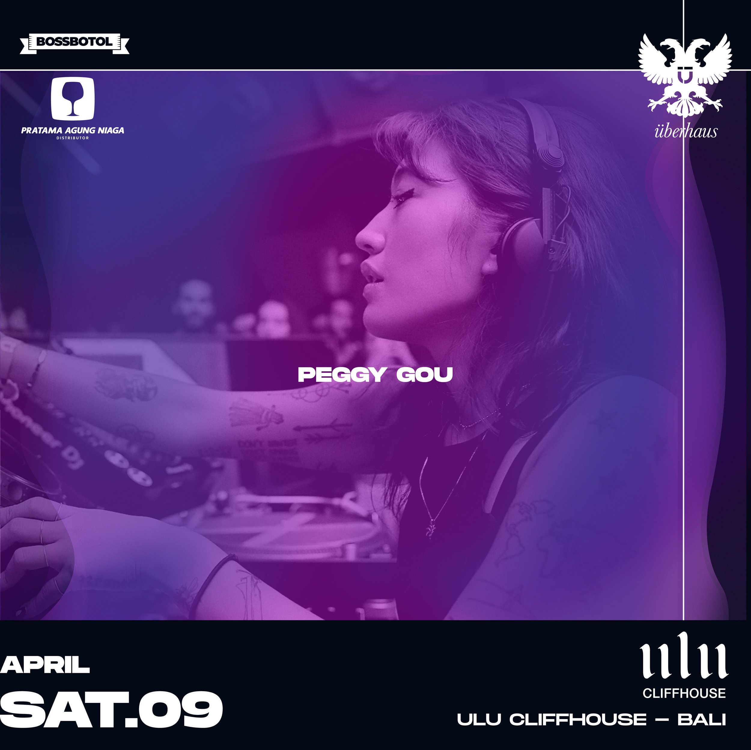
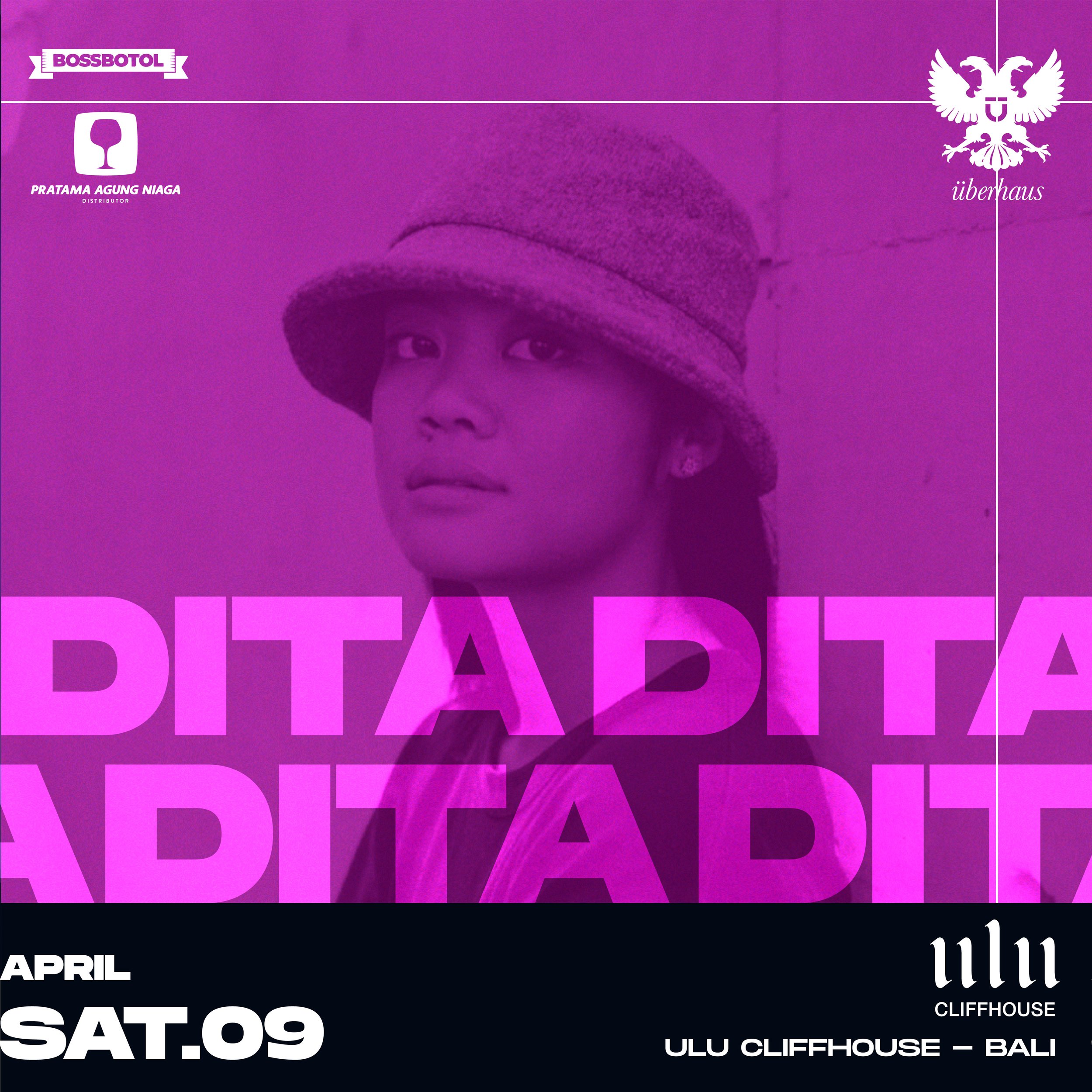
Social Media Design
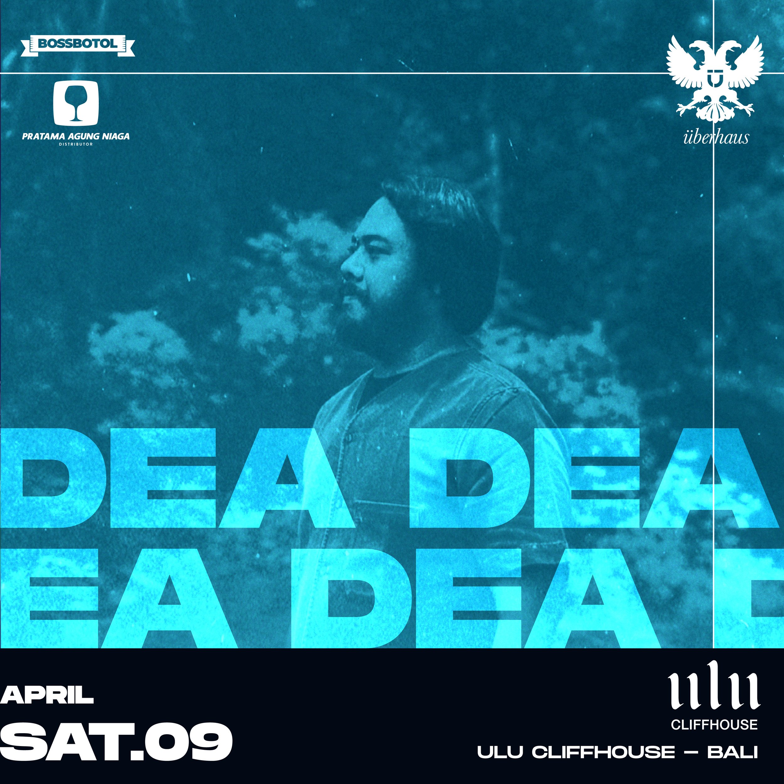
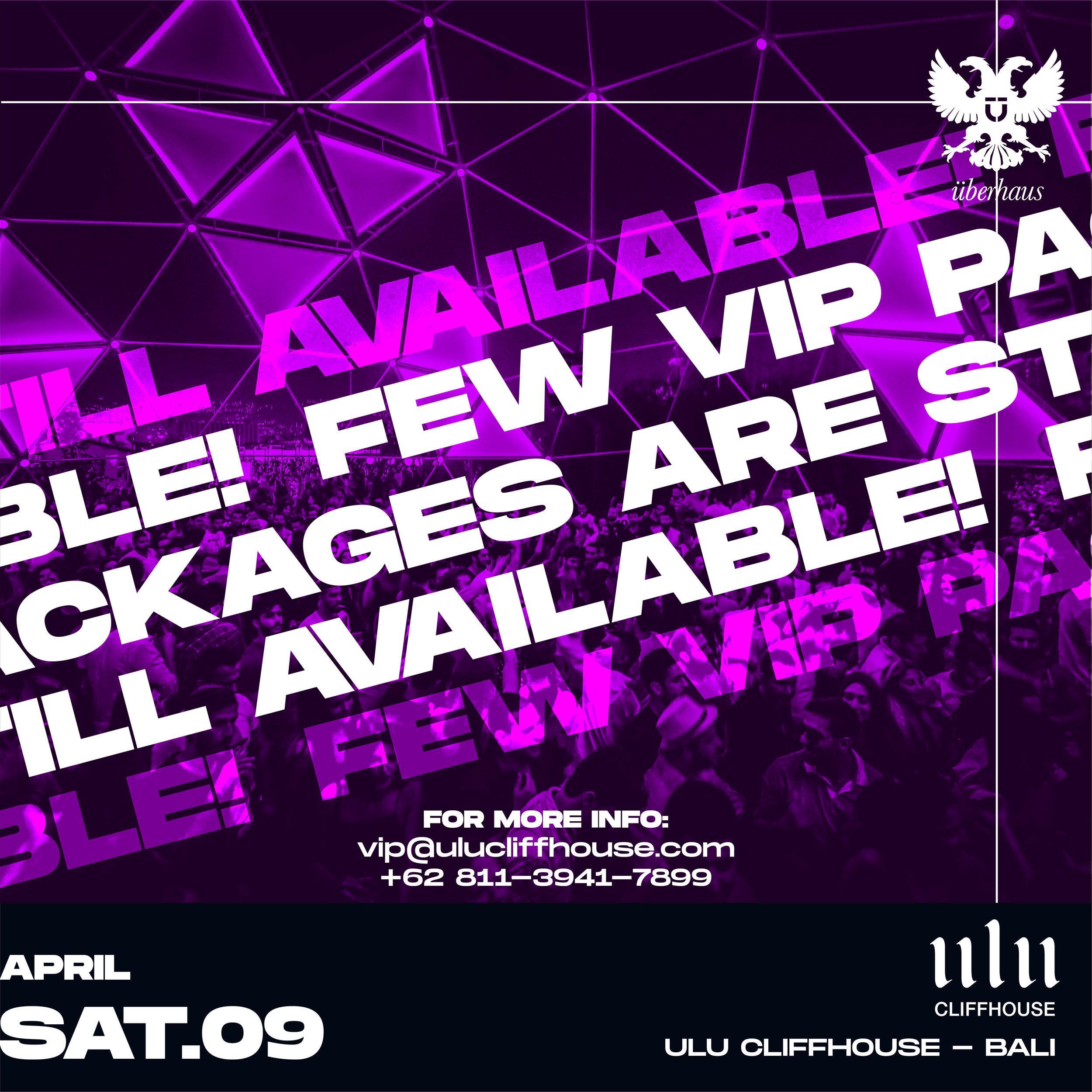
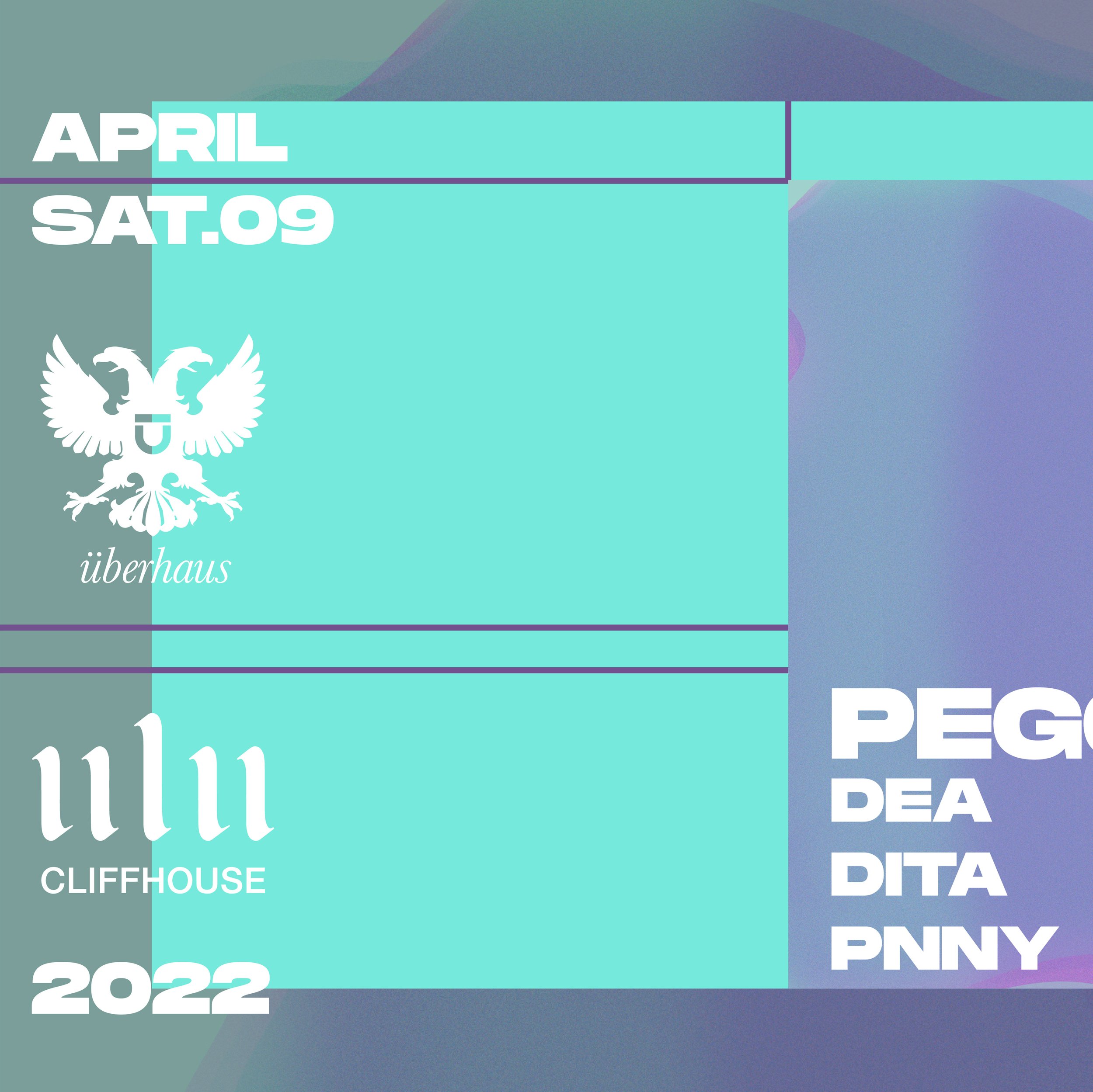
Animated Flyer Design
Layout & Typography
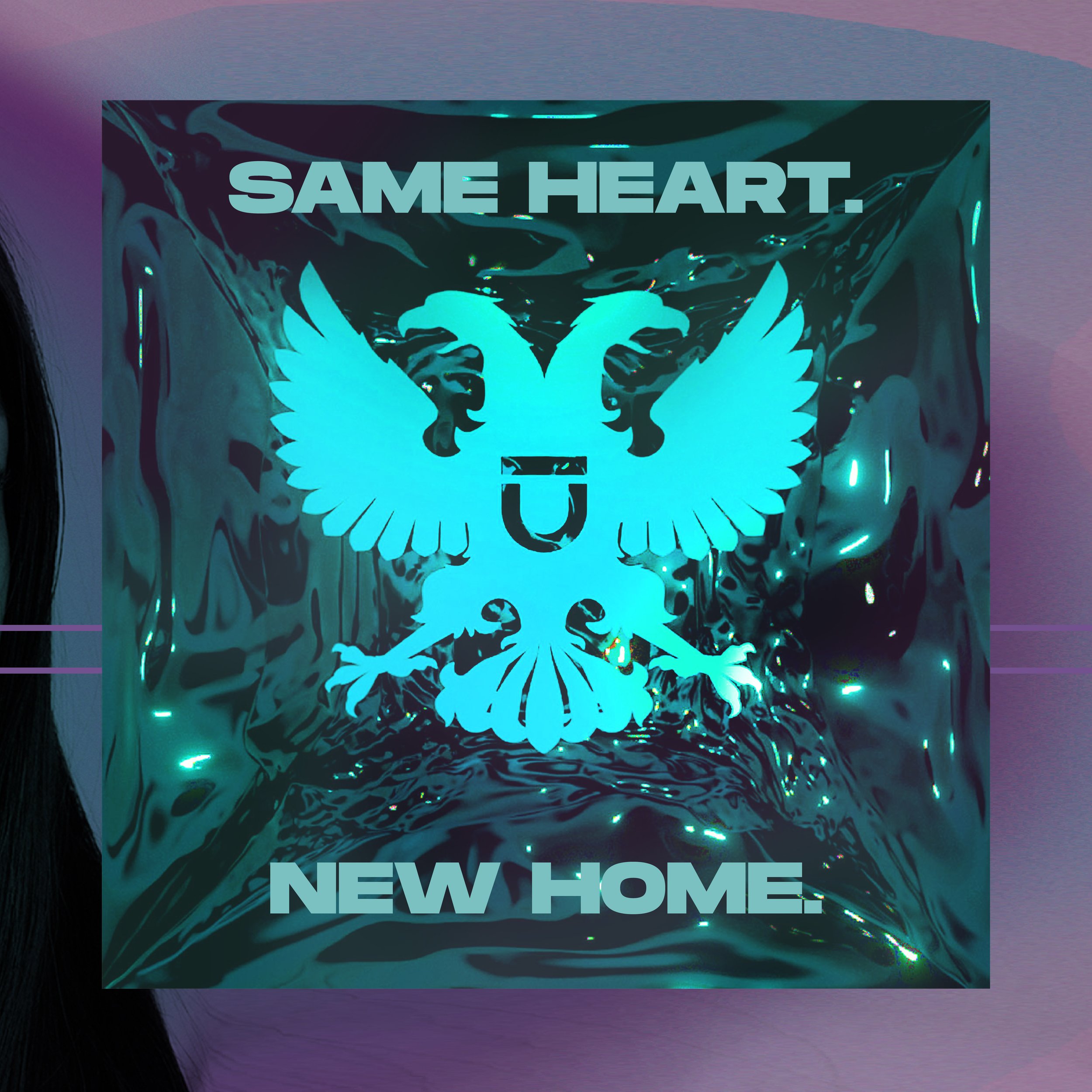
Logo Re-Design & Animation
Re-branding
Visual Identity Design
Stage Production
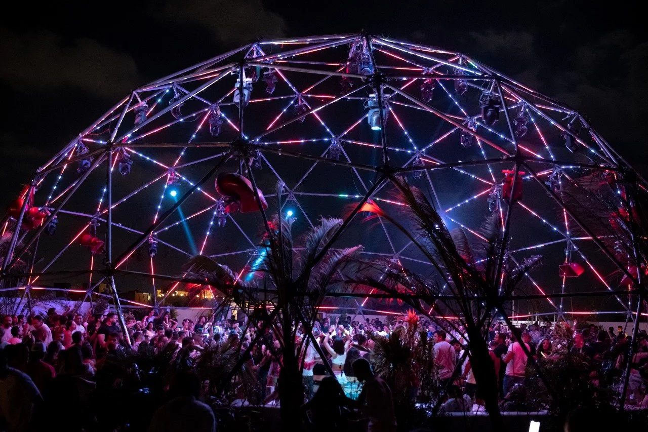
Overview
Uberhaus is a Beirut-born nightlife institution that grew into an international force in the electronic music scene. Known for its immersive spaces, custom-built venues, and cutting-edge audiovisual setups, Uberhaus offered more than events, it created experiences. As the brand evolved, it needed a refreshed identity that honored its underground legacy while embracing a bolder, more dynamic visual direction for a global audience.
Challenge
The rebrand needed to balance the raw, industrial DNA of Uberhaus with a more vibrant and expressive tone fit for wider markets. It was about transformation without disconnection, keeping the edge while opening the door to color, movement, and new energy across all touchpoints.
Approach
We reimagined the visual identity through a dual lens: gritty and graphic. The logo was redesigned and animated to be more dynamic, while flyers and social content adopted a kinetic, pop-forward style, blending vivid colors, bold typography, and animated layouts. Every asset, from event visuals to digital strategy, was crafted to pulse with the energy of the music and spaces Uberhaus creates. The result is a brand that now lives across screens and stages, fluid, expressive, and unmistakably Uberhaus.
Subtle Revamping
The Idea Behind the Logo Design
To evolve The Garten identity for its new venue, the original wordmark was preserved as a visual anchor, but recontextualized with a bold, pop-up font layered behind it, adding playfulness and contrast. The color palette was also revisited and enhanced to feel more vibrant and alive, matching the energy of the space and appealing to a broader, younger audience.
The animated logo builds on The Garten’s existing visual assets, bringing movement and rhythm into the identity. Previously designed shapes, textures, and motion elements were integrated into the new sequence, while the wordmark itself was brought to life through subtle animation and the animation of the Pop up. The result is a refreshed, dynamic mark that feels both familiar and forward, bridging the brand’s roots with its next chapter.
Bali ✦ Indonesia


APOLLONIA
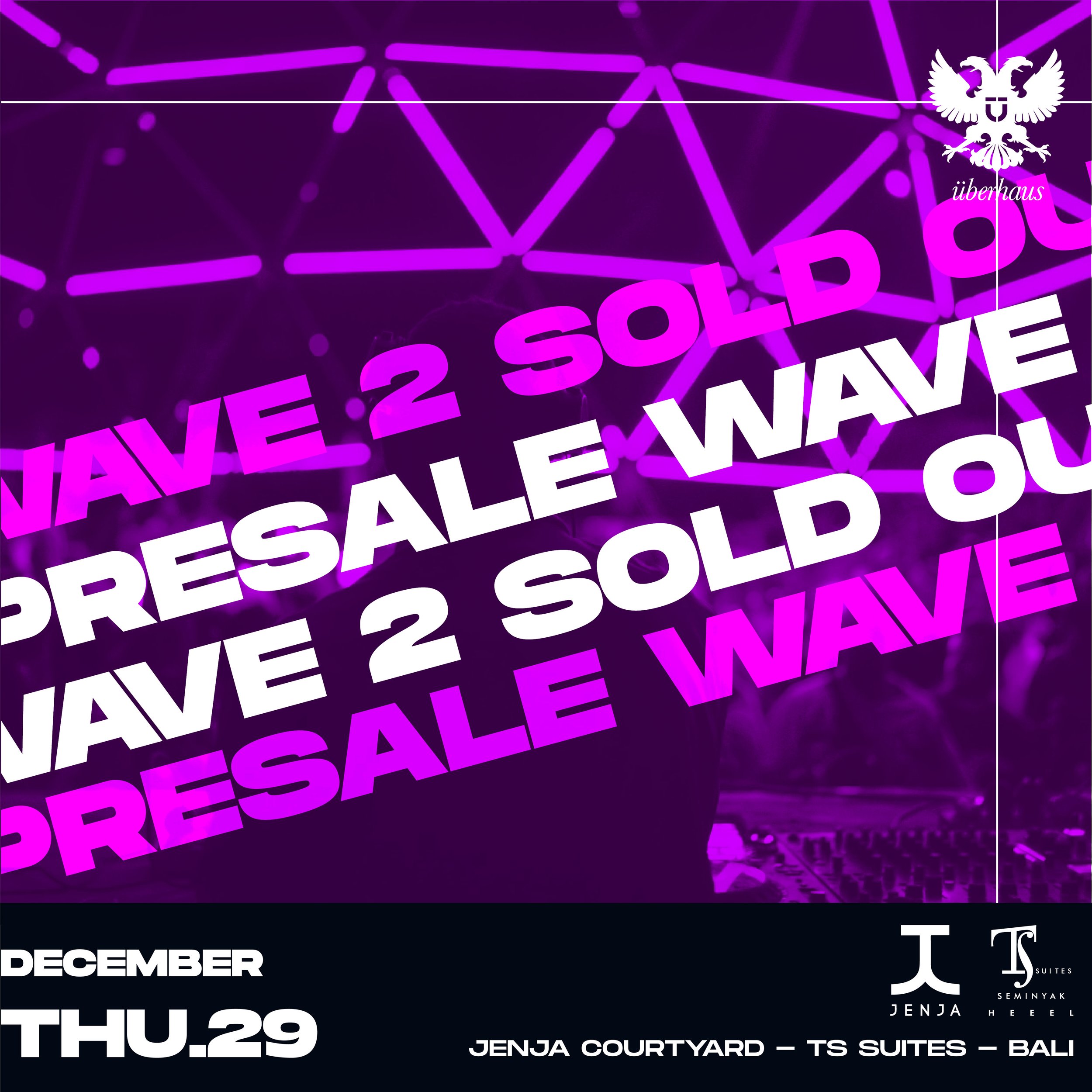
Bali - Indonesia - DEC 2022


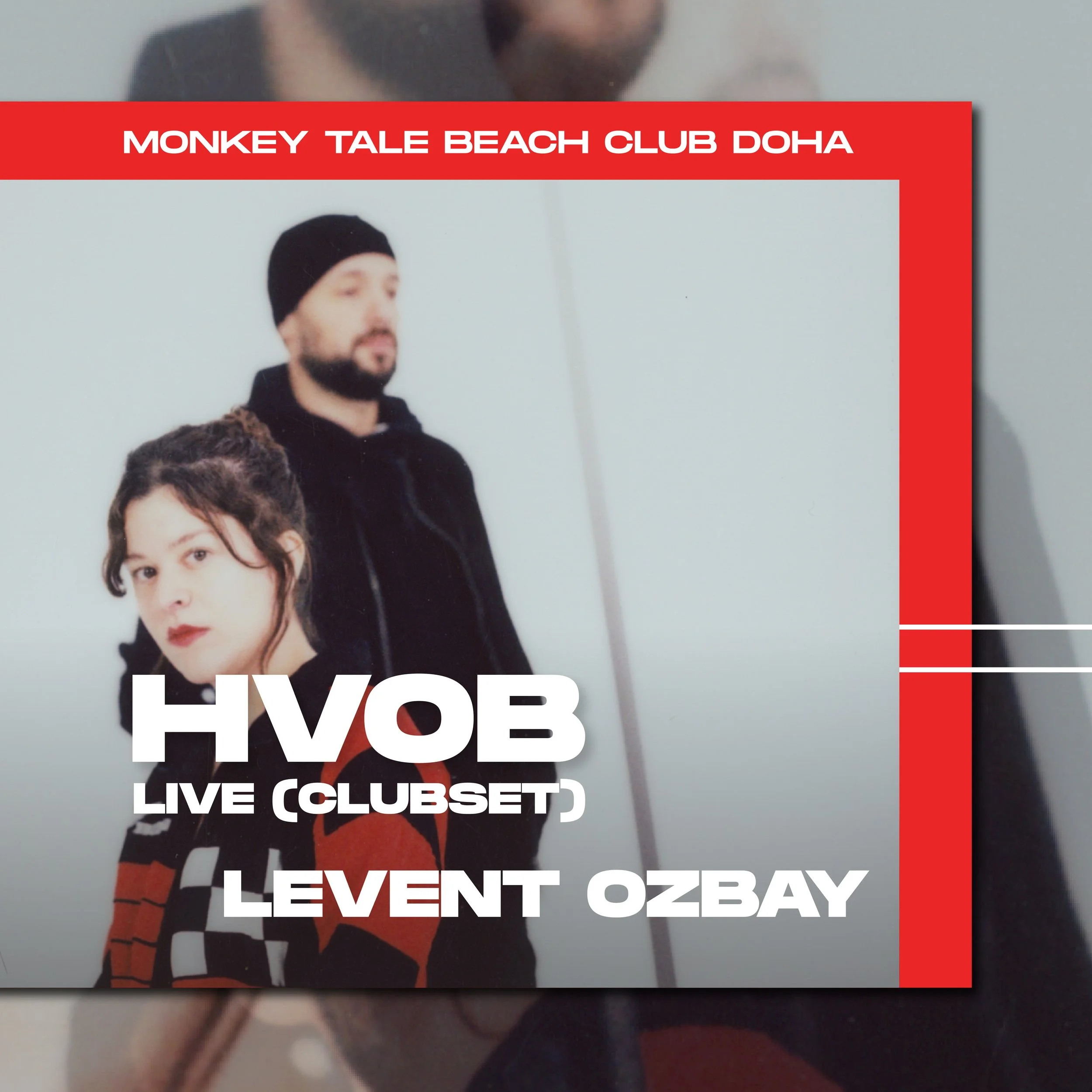
Doha ✦ Qatar


ADRIATIQUE
Doha - Qatar - DEC 2021
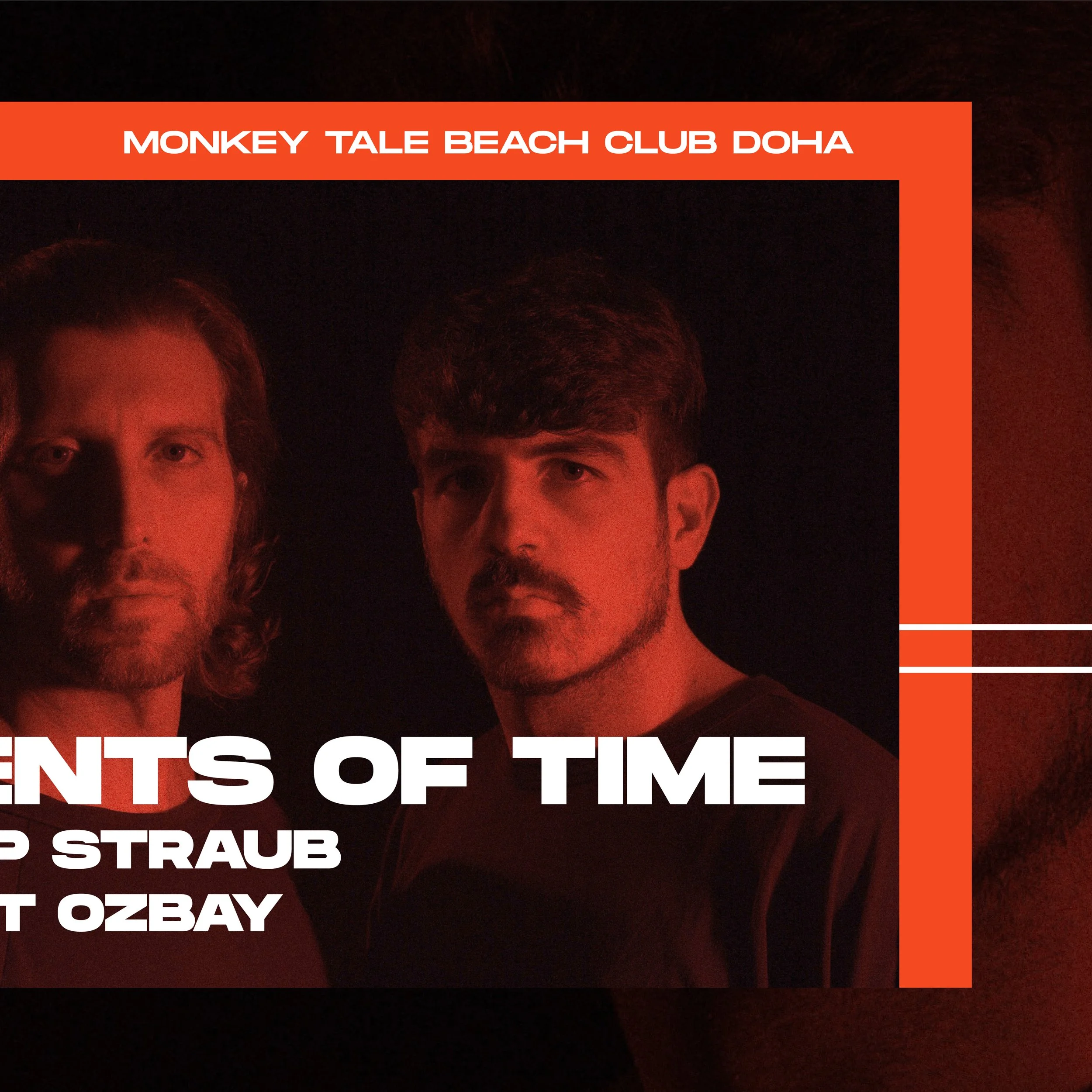
AGENTS OF TIME
Doha - Qatar - MAY 2022


BEDOUIN
Doha - Qatar - NOV 2022


AGENTS OF TIME
Doha - Qatar - MARCH 2022


Sahel ✦ Egypt


ARCHIE HAMILTON
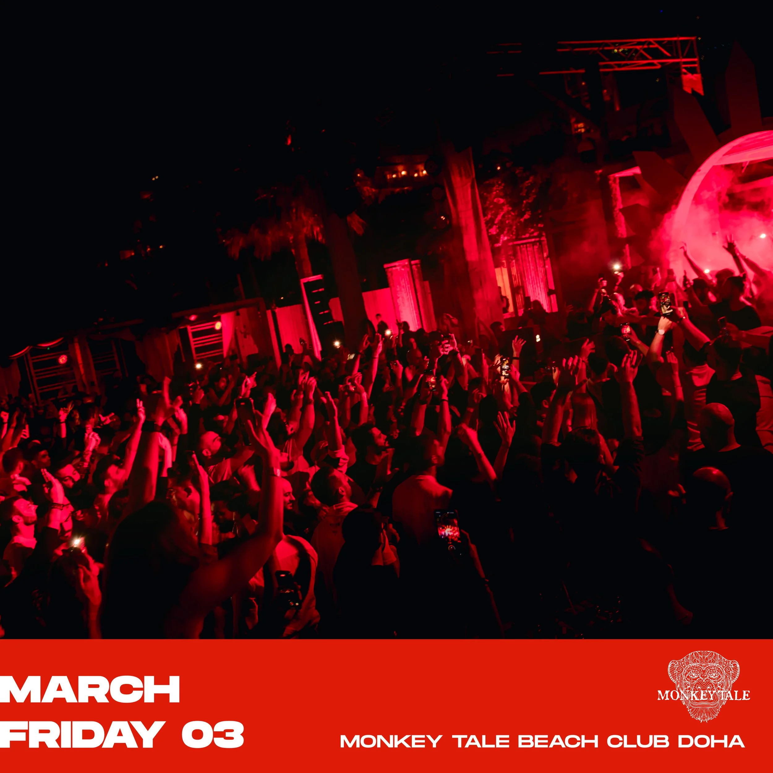
Doha - Qatar - AUGUST 2022


APOLLONIA
Doha - Qatar - AUGUST 2022


TRAUMER
Doha - Qatar - AUGUST 2022


LEHAR
Doha - Qatar - AUGUST 2022


